Over the course of an entire semester, Jennifer Mastromonaco and I learned the skills needed to create a brand. We learned how to curate a brand’s personality and raise brand awareness through marketing basics on advertising materials and consumer psychology. A large portion of our efforts was devoted to creating professional visuals and typography, including a logo, guidelines, stationery set, promotional items, and an ad campaign, all consistent with our brand recognition.
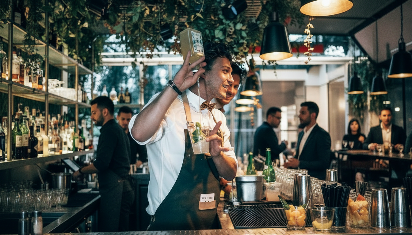
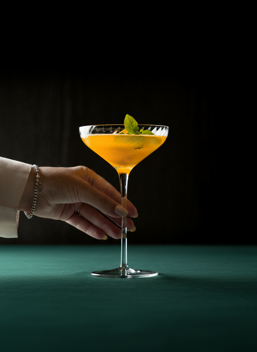
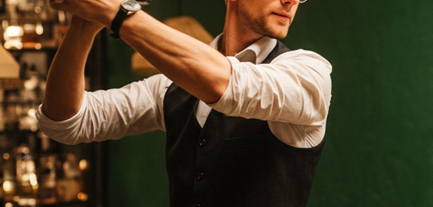
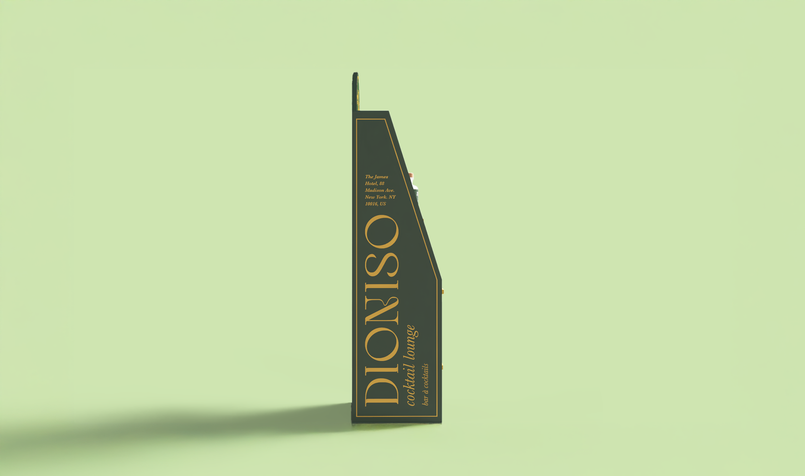
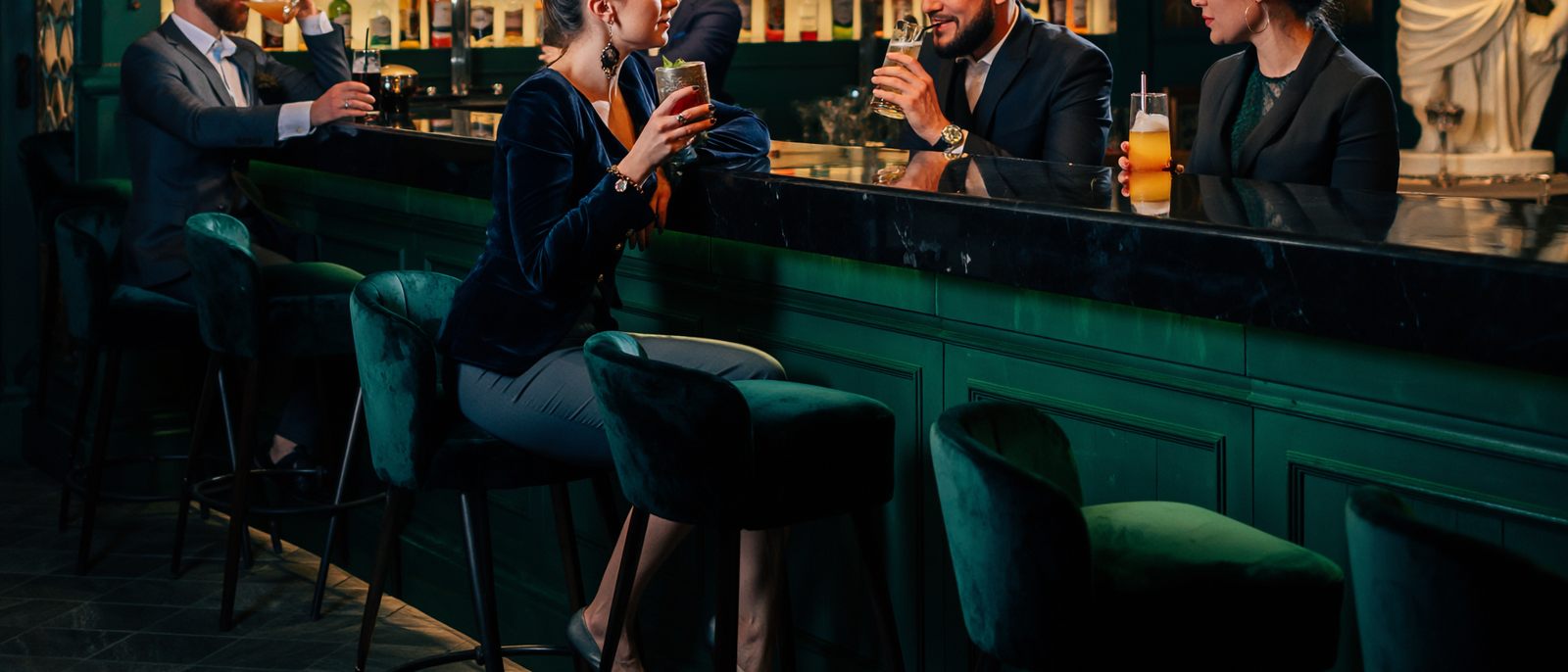
We created Dioniso, a high-end Italian-Greek themed cocktail lounge that caters to middle-class adults ages 25-60. It is a luxury lounge that offers a quality experience while sipping flavourful cocktails. We specialize in smoked cocktails to offer a multi-sensory experience, combining our wide variety of flavoured smoked wood chips with the best of alcoholic beverages.
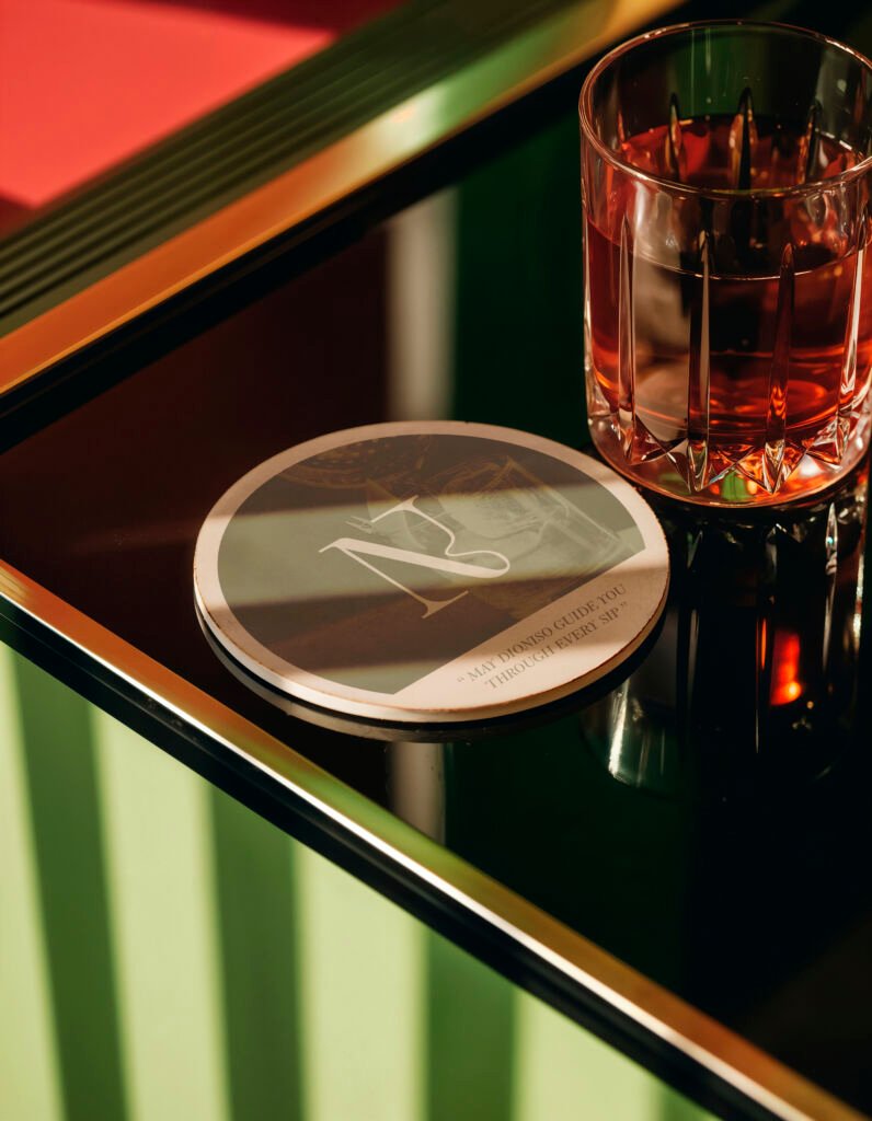
This is where smoke curls and dances through the air, where each drink is a crafted symphony of flavour, and where every moment invites you to surrender to the senses.
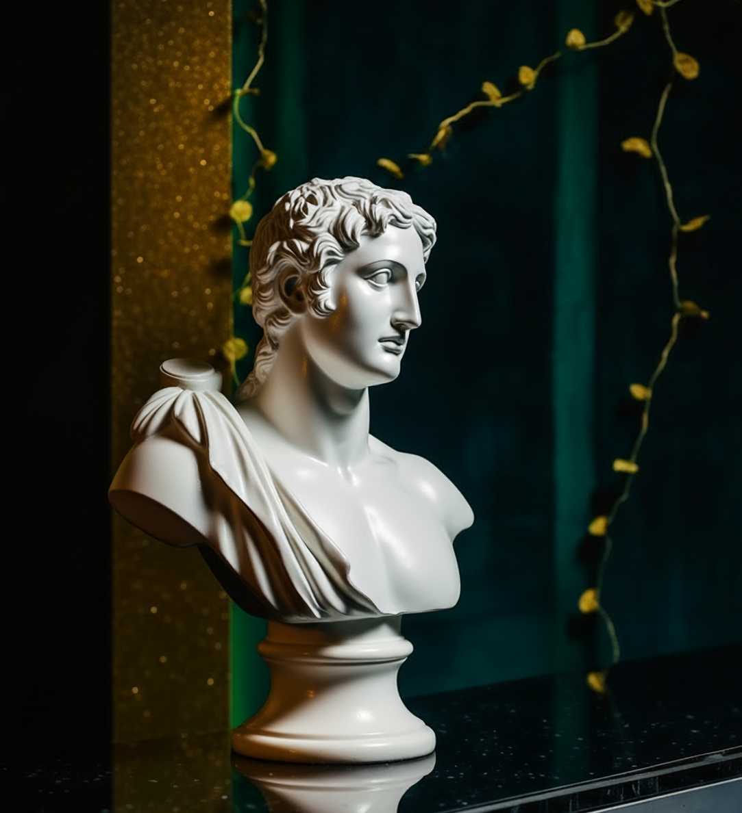
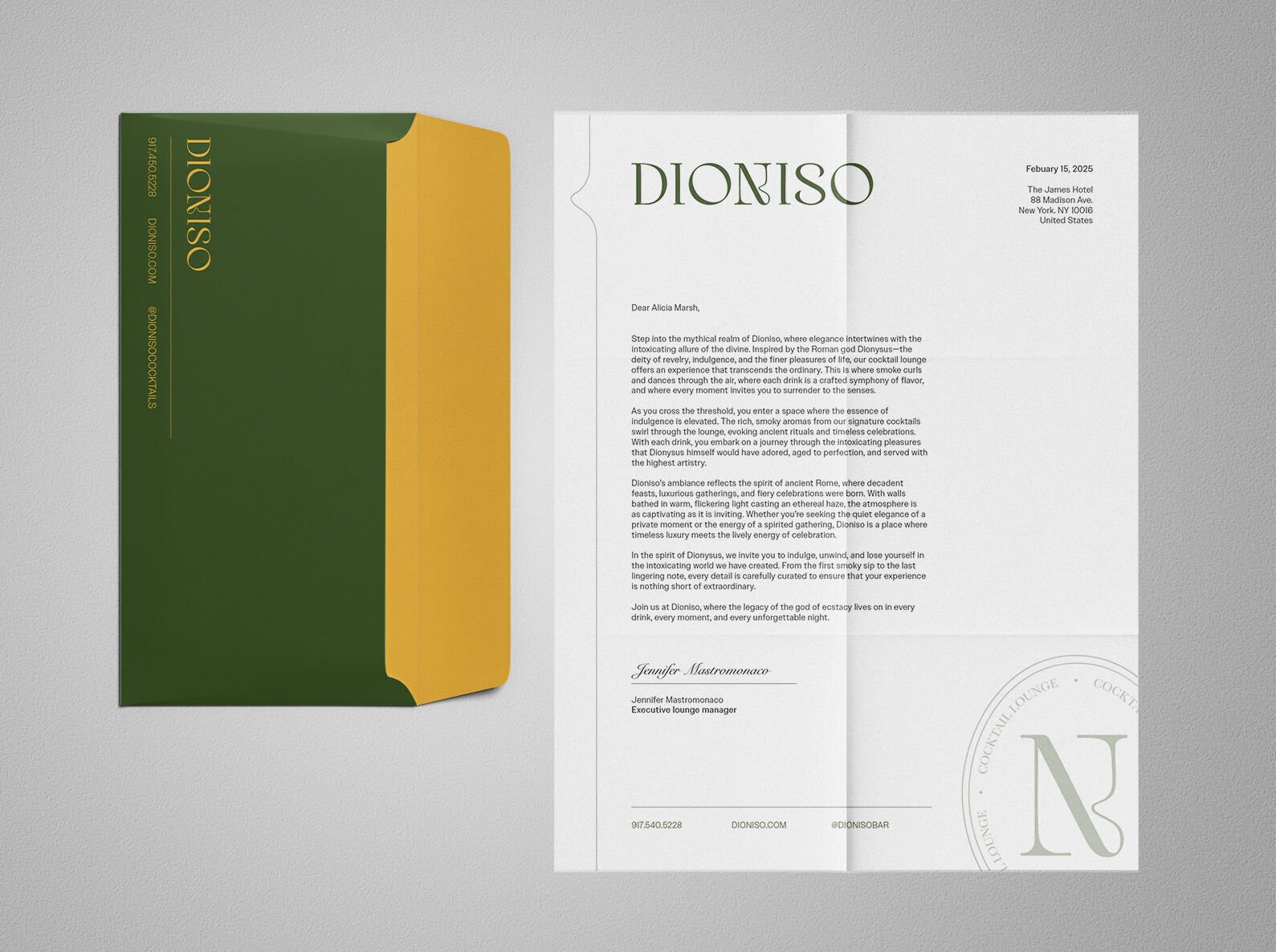
Welcome to Dioniso, where elegance intertwines with the intoxicating allure of the divine. Inspired by the Greek god Dionysus—the deity of revelry, indulgence, and the finer pleasures of life, our cocktail lounge offers an experience that transcends the ordinary.
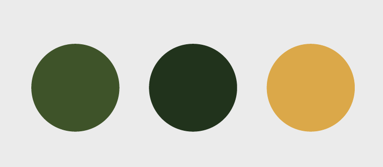
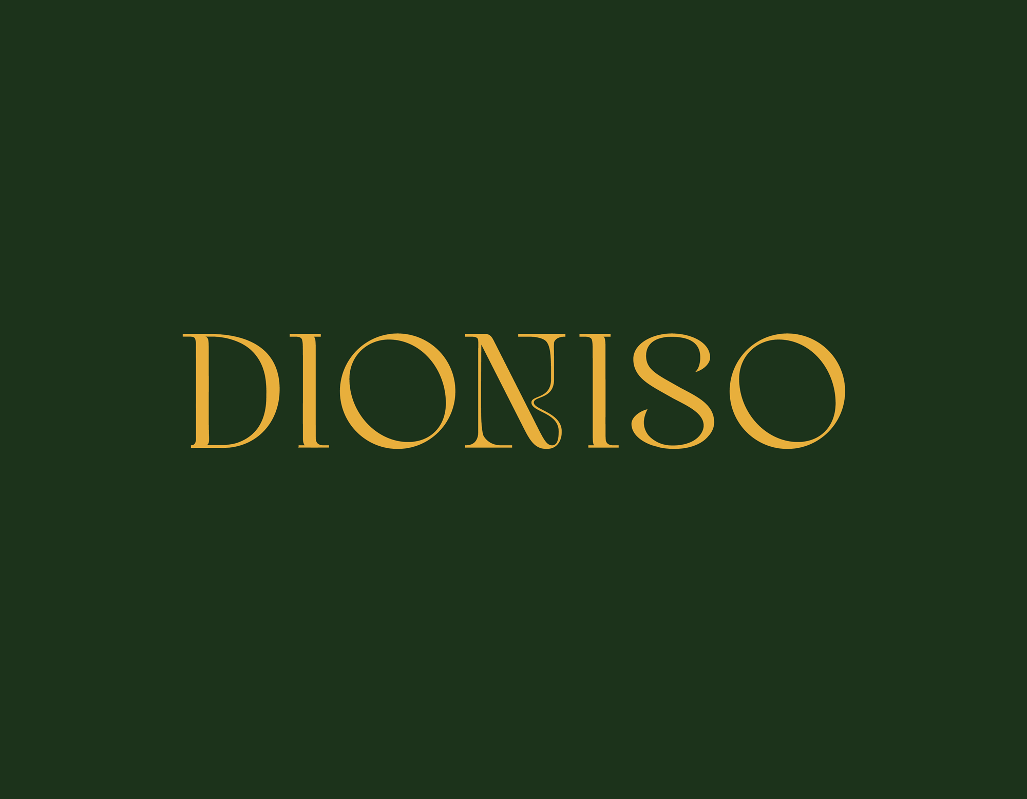
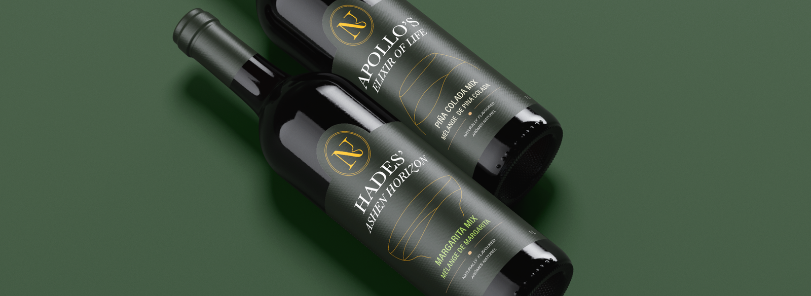
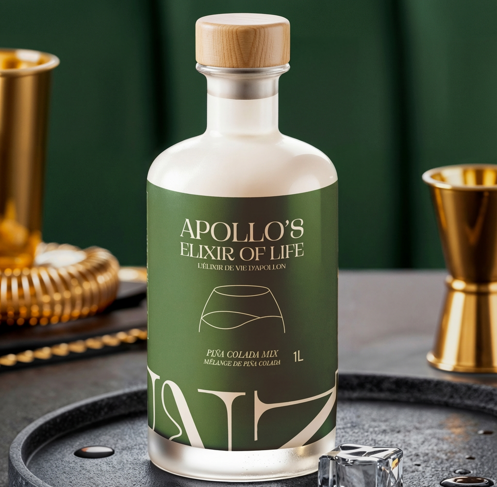
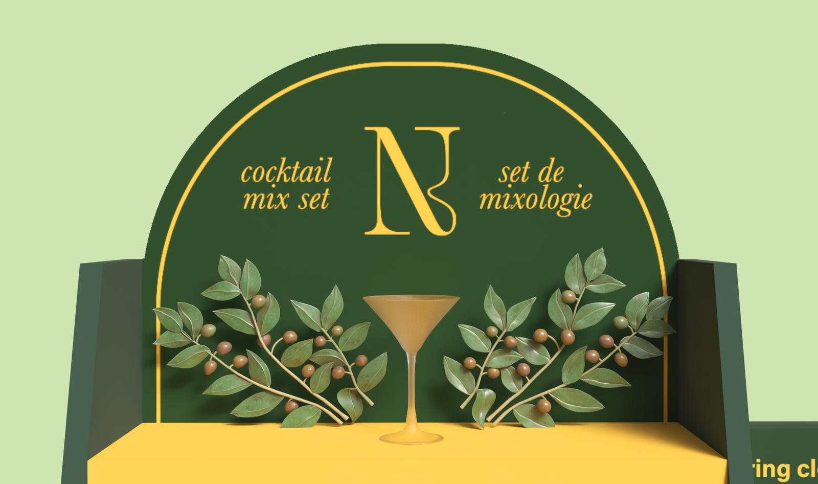
The colour palette was selected from an image and later modified through our logo and moodboard design process. The greens were selected to reflect the vines that are often incorporated in the Greek art of Dionysus, while warm yellow represents the luxury feel of gold. Dioniso’s use of green can also be interpreted as something that is environmentally sound, as green itself represents nature, health, and life.
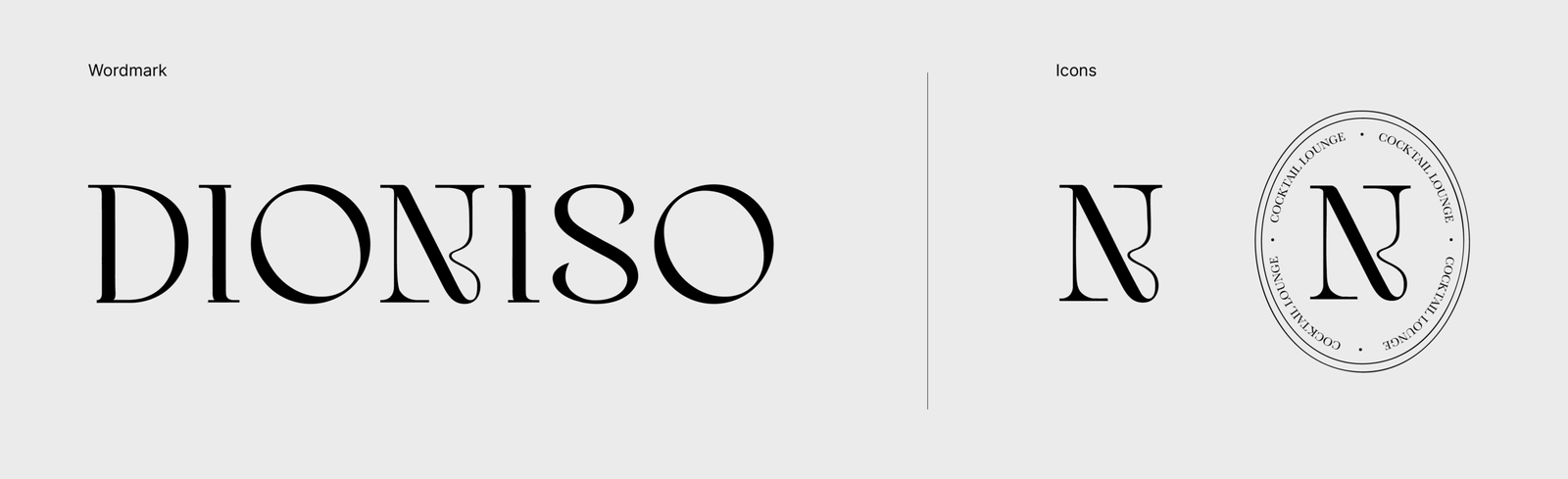
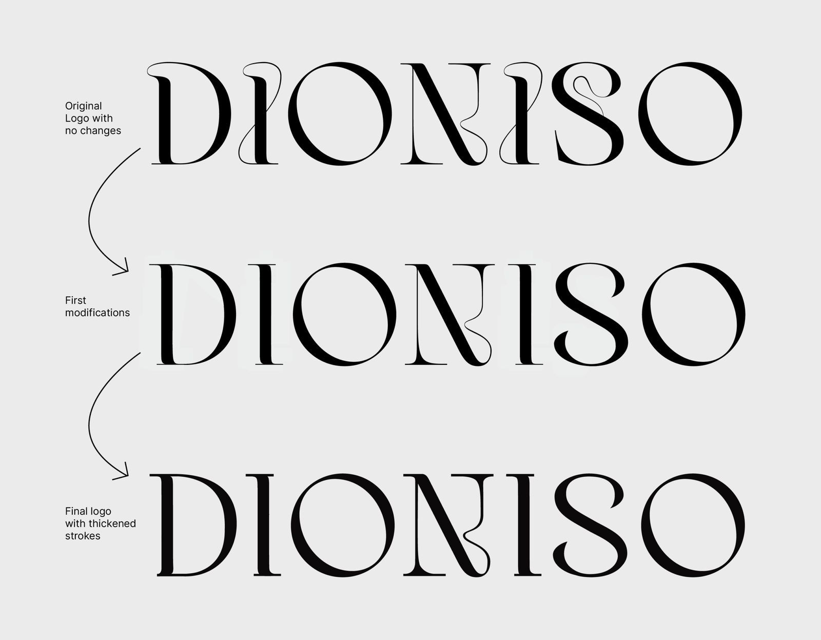
Logo Process
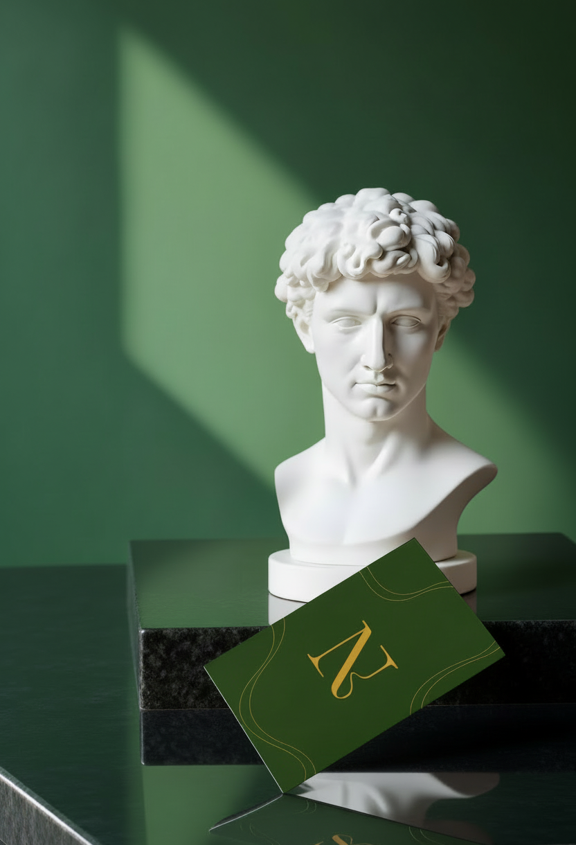
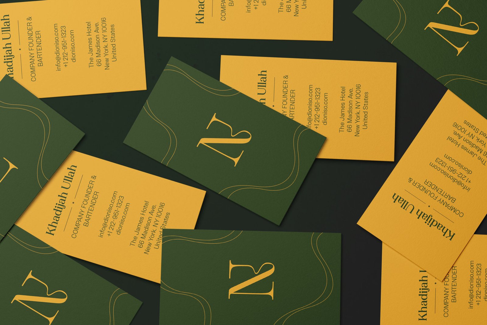
In designing the logo, I aimed for something elegant, high-end and eclectic. Here, the oval submark was designed by Jennifer. The submark of the letter N contains a subtle swirl that was part of the original typeface Kondo, and was kept to represent the smoke from our smoked cocktails, as well as the feeling of delight when drinking.
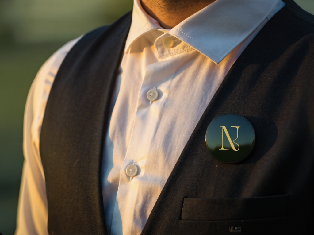
We continue to express this swirl across our stationery, business cards, and promotional items. I designed the business cards, custom pins for employees and customers
Stationary Items
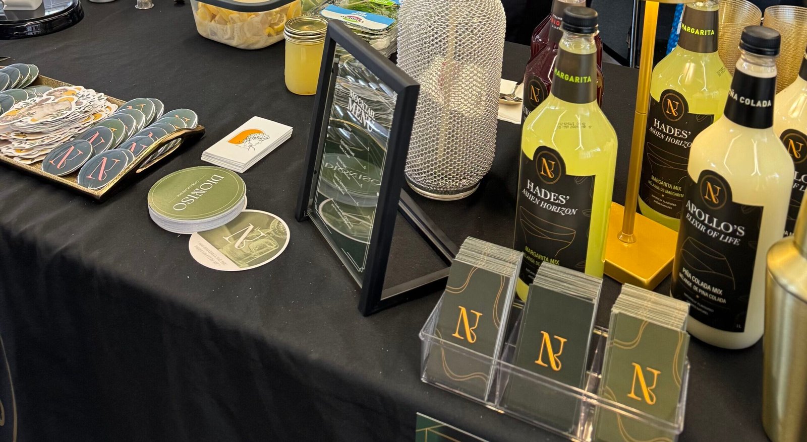
Promotional Items
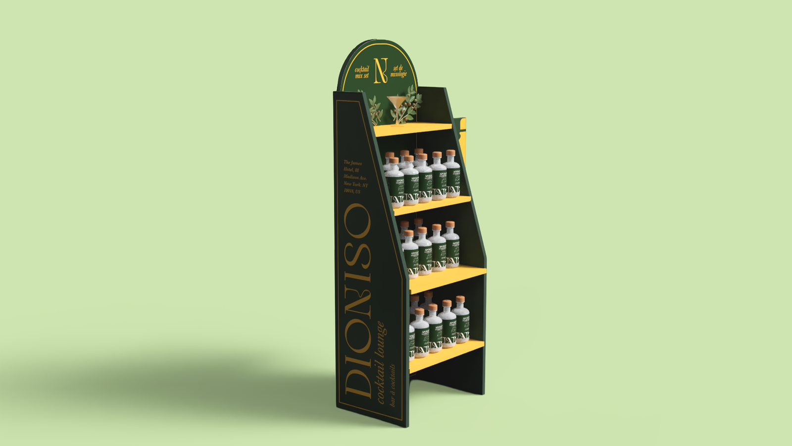
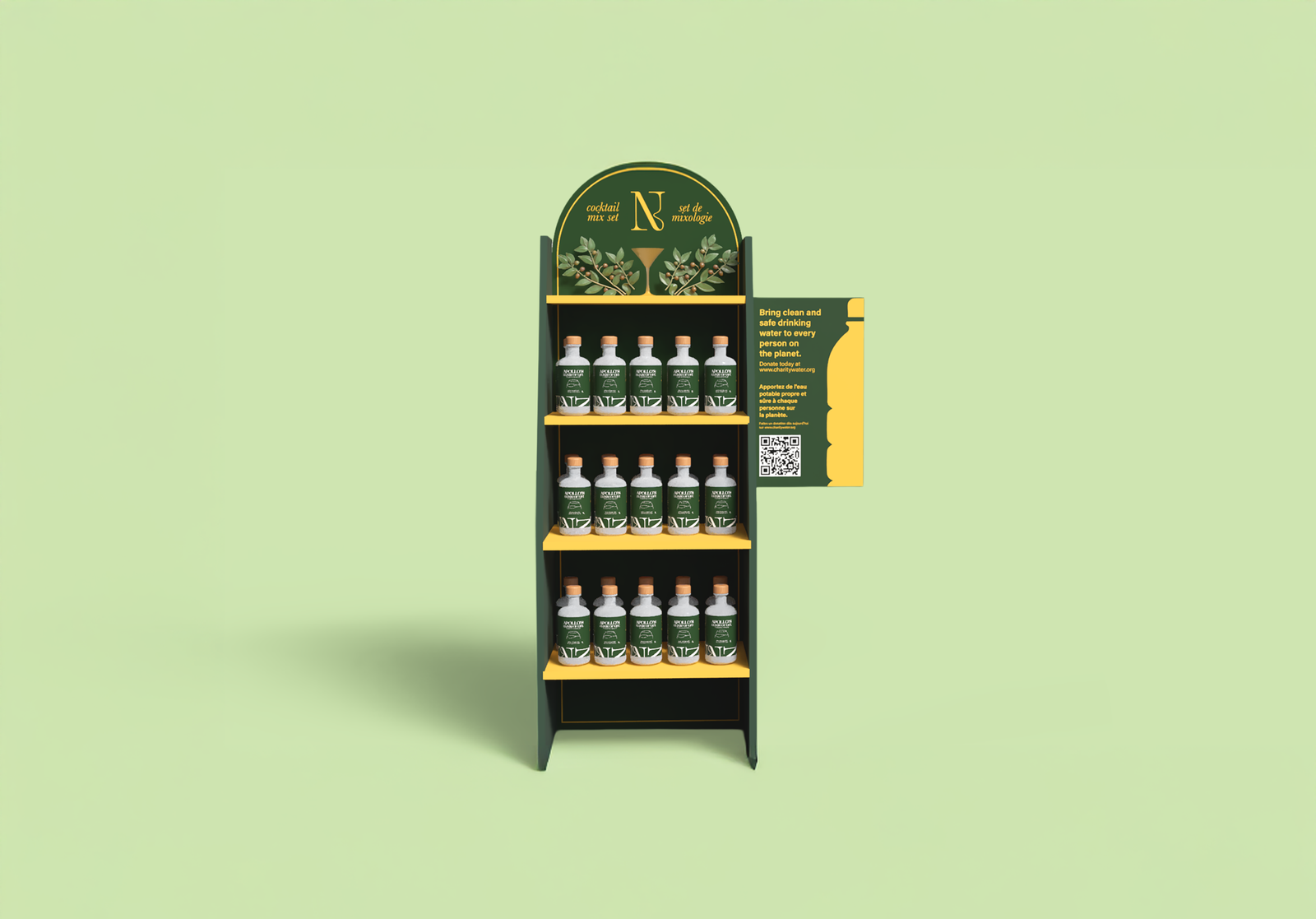
Sustainable Design
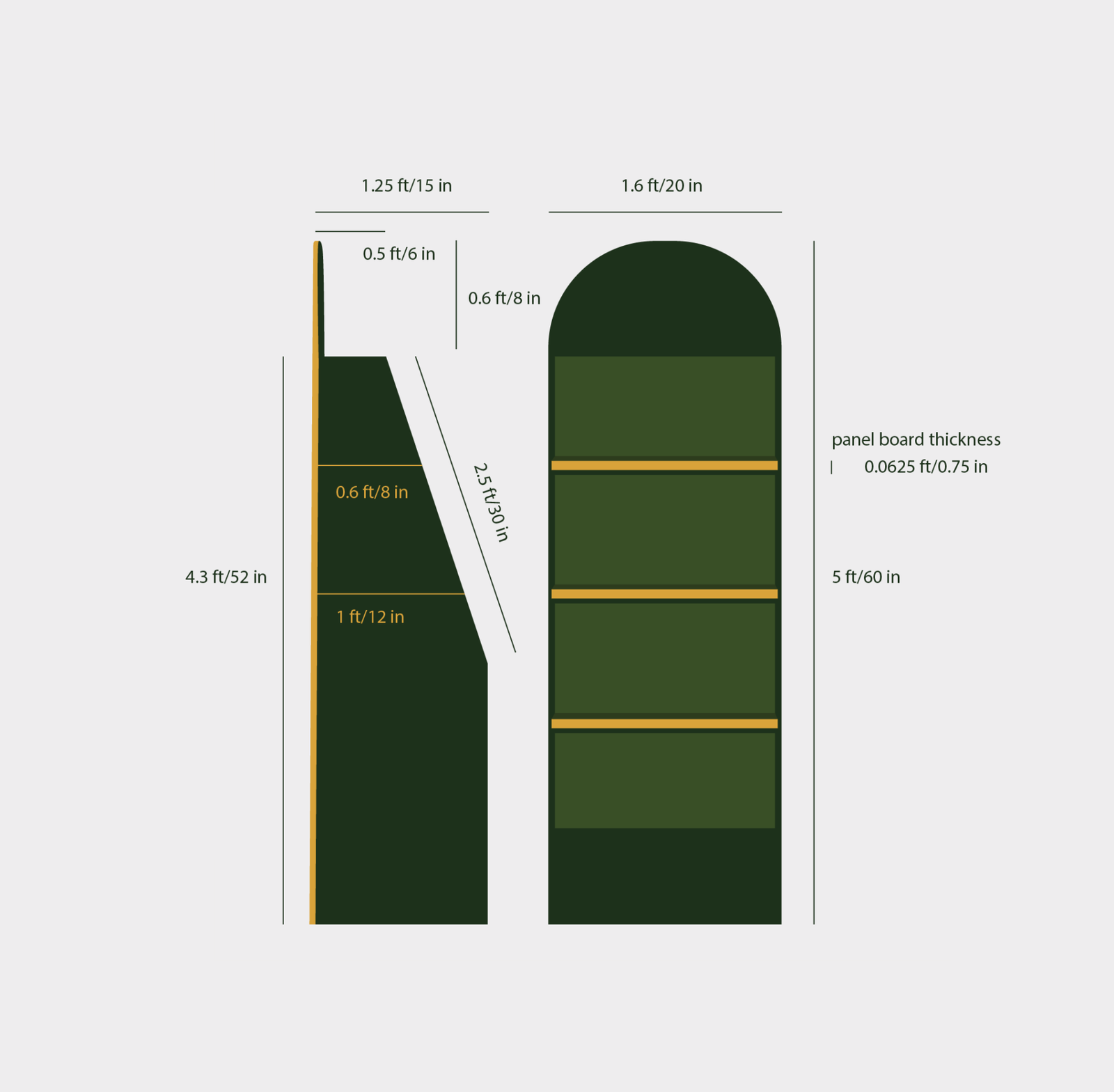
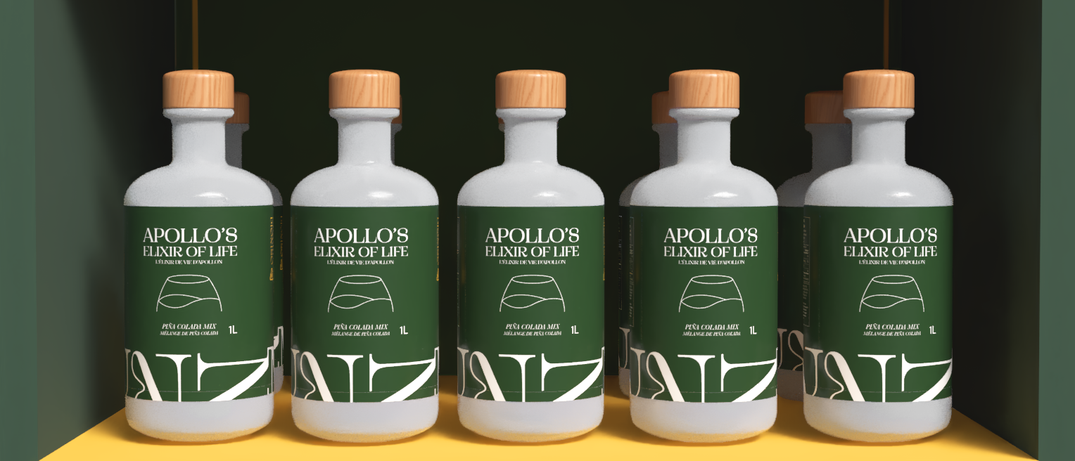
In redesigning the cocktail mix set, I adopted a more sustainable approach by switching from PET bottles to glass. Since PET plastic bottles require a more complex recycling process in terms of sorting and cleaning (decontamination) for reusability, glass seemed like the optimal option as it uses a closed-loop recycling process. This means that it can be recycled and reused into a new glass over and over again.
Moreover, this process uses up to 95% less energy than making new glass from raw materials. I also added a glass recycling symbol and a few lines denoting how this packaging is beneficial to our environment.
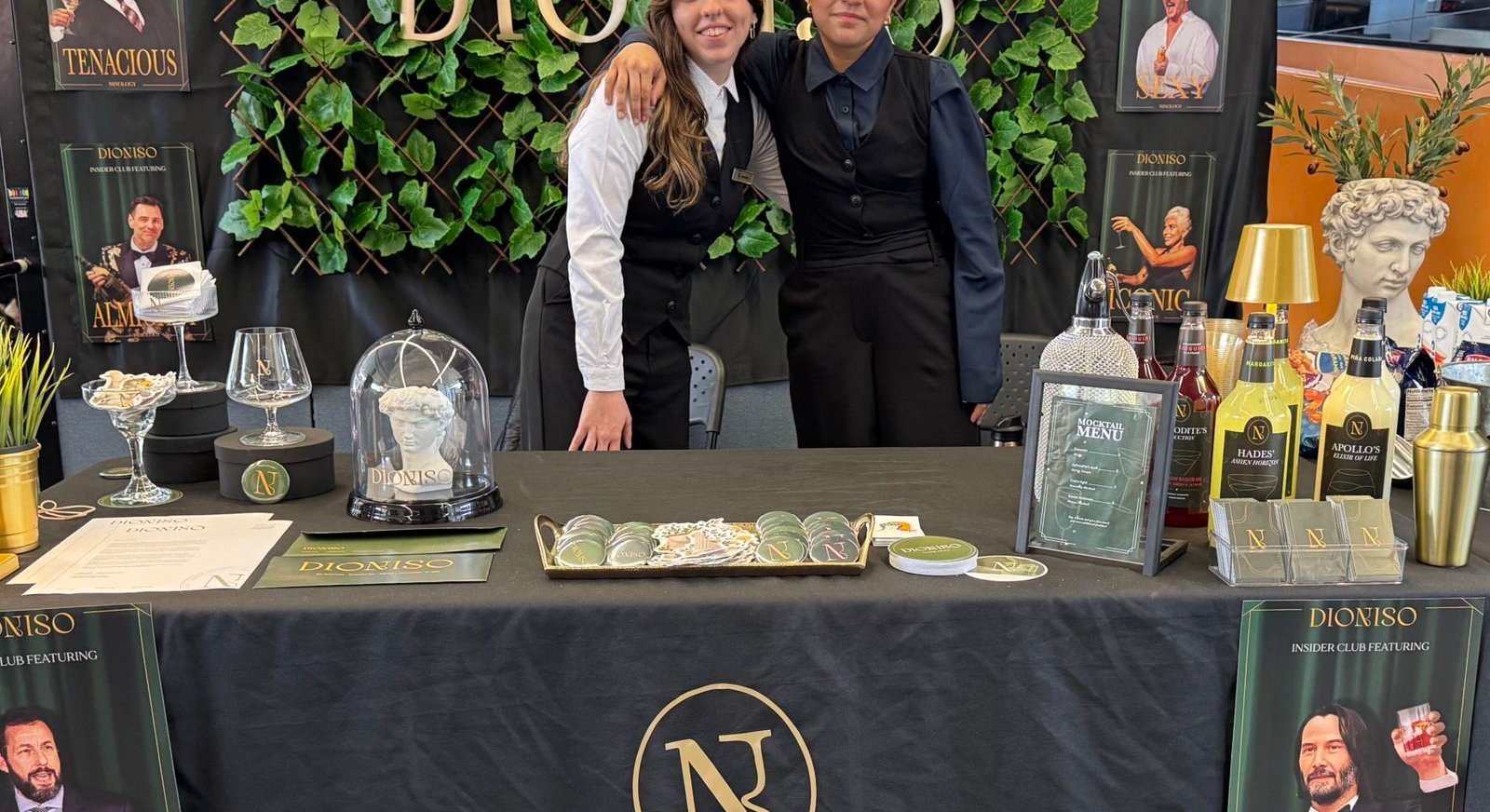
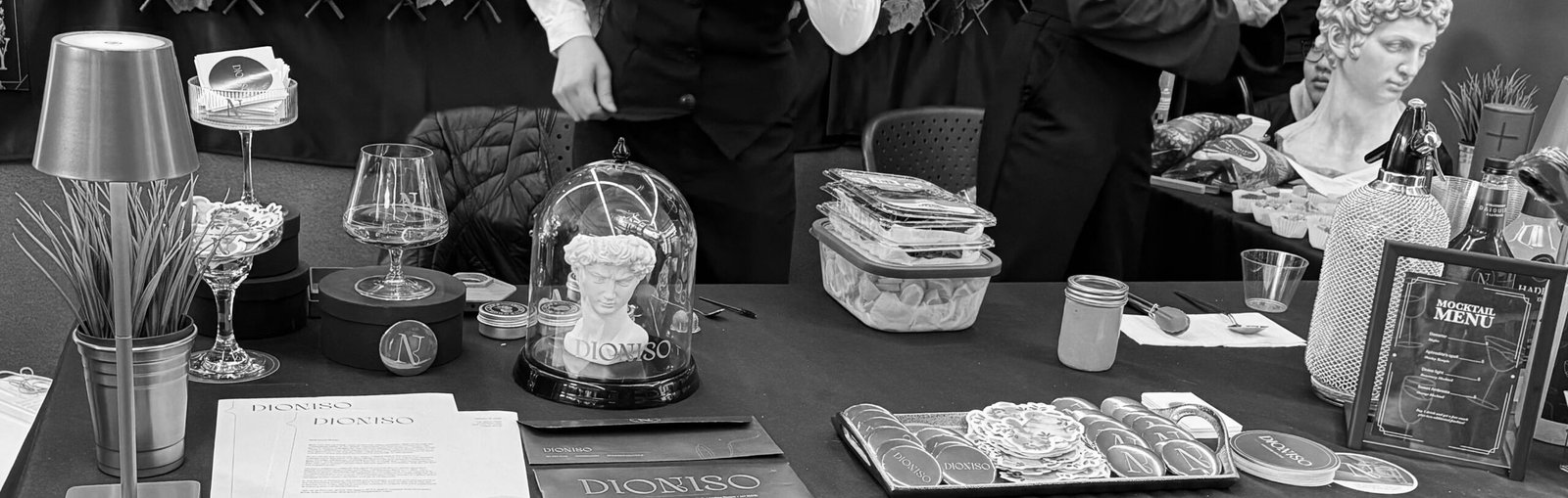
Brand Expo
All of our work culminated in the Brand Expo, a special event allowing us to present our brand and product through an effective booth and display setup. This was a memorable experience as our team won the department vote for best booth!